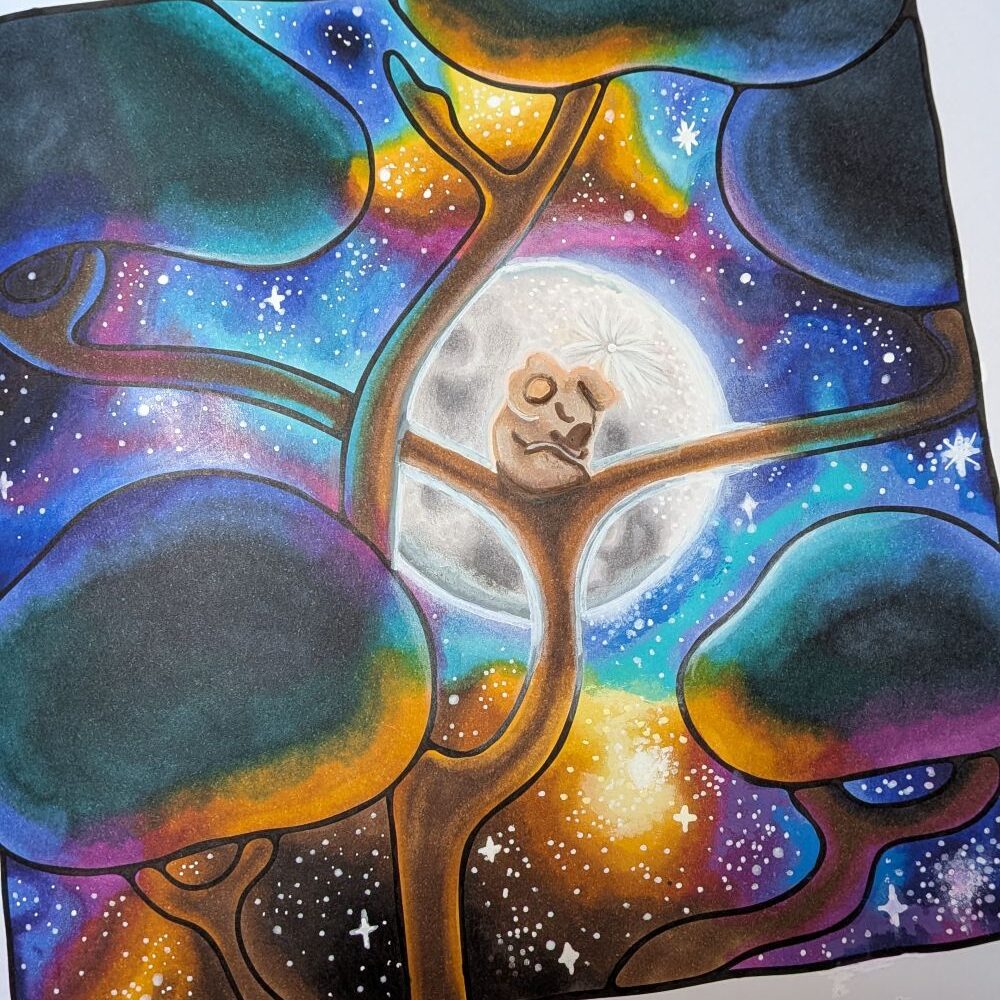
How To Colour Galaxy Skies
I may earn a commission from any purchases you make after you follow links in this guide. A rainbow galaxy
I may get a small commission from purchases made after clicking links in this article.
Have you ever looked at a blank colouring page and wondered, “Where do I even start?”
While the finished artwork can look effortless, bringing a colouring page to life, for me, involves a lot of thought and consideration. From choosing the page I want to colour, selecting a colour palette, deciding where to add shadows and highlights, and adding those final little details — every step plays a part!
I started colouring in April 2026, and treat every page as a bit of an experiement in colour matching and technique. Over time, I’m figuring out what works for me, and have developed a loose process I generally follow for each of my pages. This gives me more confidence that the page will be sucessful and I also get that thrill of knowing what I’m doing! Most importantly, it makes colouring an enjoyable and relaxing experience, rather than a guessing game.
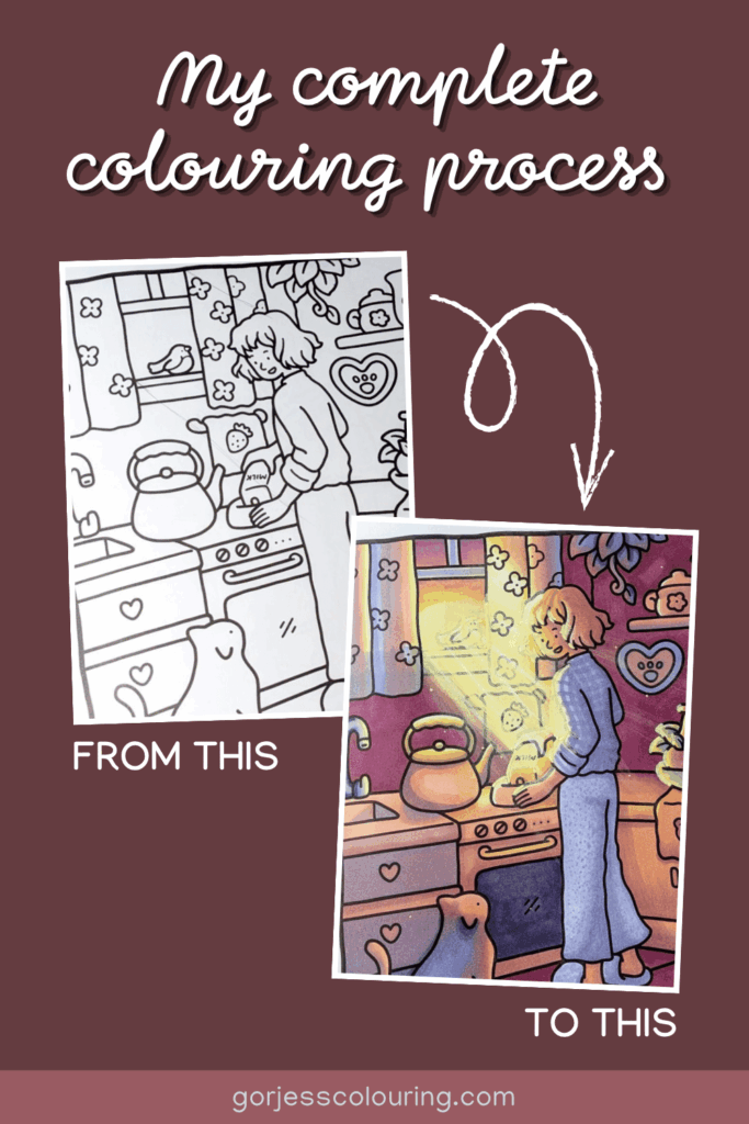
In this post, I’m taking you behind the scenes and sharing my complete colouring process — from the moment I choose a blank page to the final reveal. I’ll show you how I choose a page, plan my colours, how I build layers and depth, and the little finishing touches that help turn a simple colouring page into a piece of artwork I’m proud of.
Whether you’re new to colouring or you’re looking for inspiration to develop your own style, I hope this gives you some ideas and shows you that there’s no single “right” way to colour — the best process is the one that helps you enjoy creating! Don’t think too hard about it, pick some colours you like and put them on some paper.
This step seems a bit simple, but I actually find that it’s one of the most important to get right to set the mood for the entire page. Different colourists choose their pages in different ways; some colour consecutively from front to back in each colouring book and others choose pages in any order based on their personal preferences. I’m the later. I find it really important to have a vision or be ‘connected’ to the page in some way before I start. This makes choosing colours and the placement of shading and details so much easier later.
Sometimes I find an inspirational image or colour palette somewhere and then think of a page that it would be perfect for. Or sometimes I fall in love with a page and then go off searching for the perfect palette for it. Which everway you get inspired, I find that having that spark is super helpful to get your creative juices flowing.
With my chosen page in mind, I’ll then search for inspiration images and choose my basic colour palette. If I’ve been inspired by a set colour palette, I’ll go straight to Step 3 and choose my markers.
When it comes to finding inspiration, my main two sources are Pinterest, and the world around me. Pinterest is amazing for finding reference images for a particular mood, scene or effect you are looking for. It’s also great for seeing how other colourists have approached a page and what colours they have used.
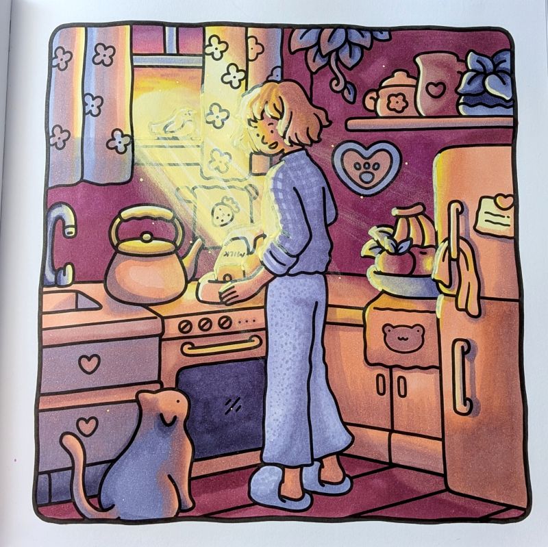
I saw the image below during one Pinterest browsing session and immediately thought it would be great for one particular page in Coco Wyo’s Girls Moments. I’ll be showing you how I select my markers and other tools plus actually start colouring in the next steps.
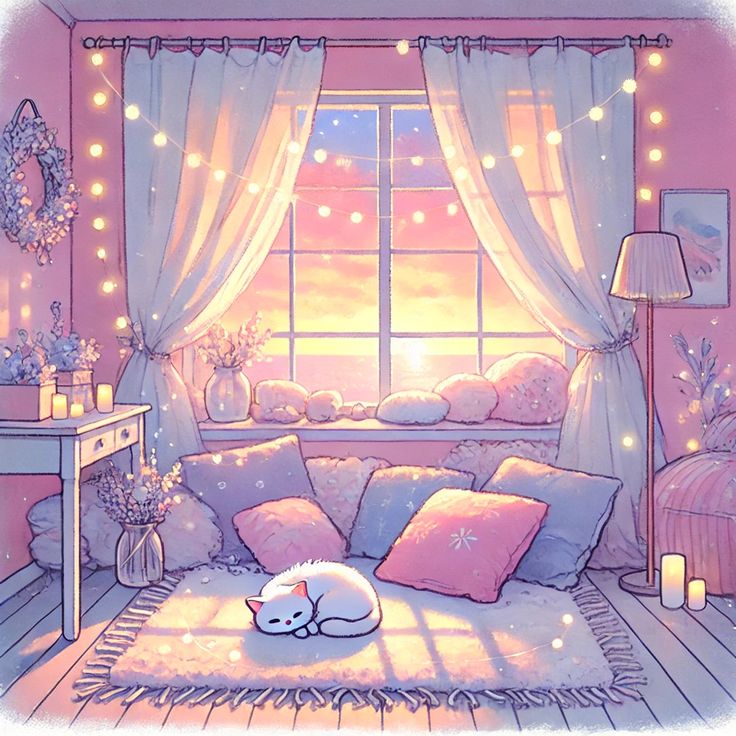
A small note about Pinterest is that there are a huge amount of AI generated images on there now. Me, personally, I find that some of these are genuinely helpful for inspiration, but some can be a bit over the top. Choose what speaks to you.
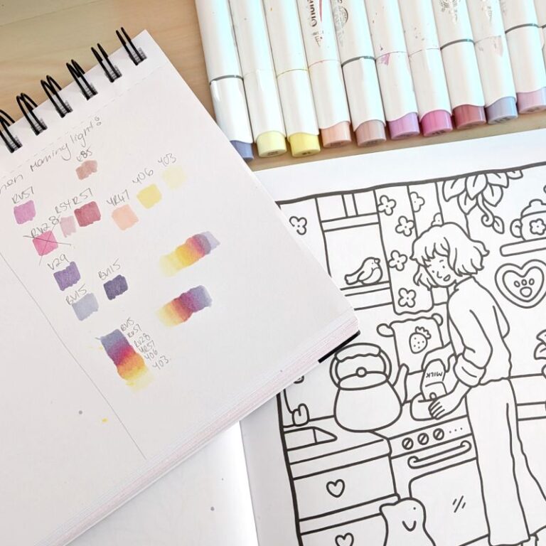
Next step once you’ve chosen the overall colour scheme for the page is to choose the marker palette you’ll colour with. I like to select the main shades first, and then select matching light and dark shades of those. I go into more detail on how I choose my colour palettes in this article.
For this particular page I chose these colours to match my inspo image:
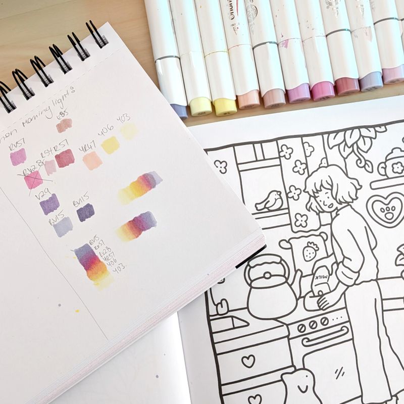
Something that I like to wait to choose colours for and come back to this step after I’ve coloured the rest of the page is for the hair/fur, skin tone and clothing of any figures in the page. While I found choosing the base colours for the scene in the page easy based off my inspo image, I needed a little more time to select colours for the girl in the image – thats ok!
Now the fun begins! The area I choose to color first will depend on my mood and if there are any special effects that need to be planned out on the page. If there are no special effects, I basically choose an area I like and go for it, after all it’s supposed to be fun right?
For this page, I planned to do a soft sunray/light effect coming from the window so I had to mark that out with pencil first before colouring anything else so I know where to place my lightest colours and also where my shadows will fall. I typically do this with a pencil and ruler, but you can freehand it also. Sometimes I’ll also pencil in my shadows if they are particularly complex.
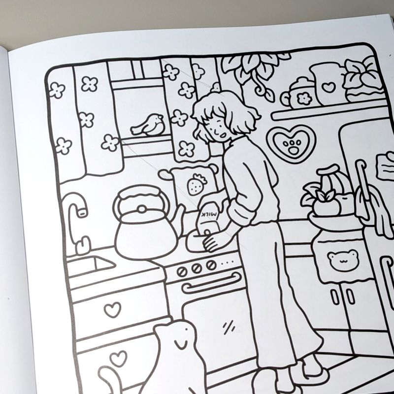
Note on pencil lines: Be careful when colouring over these with your markers, they will show up under lighter shades. I like to erase mine just before colouring so they don’t show.
Then I just go for it laying down my base with my chosen markers!
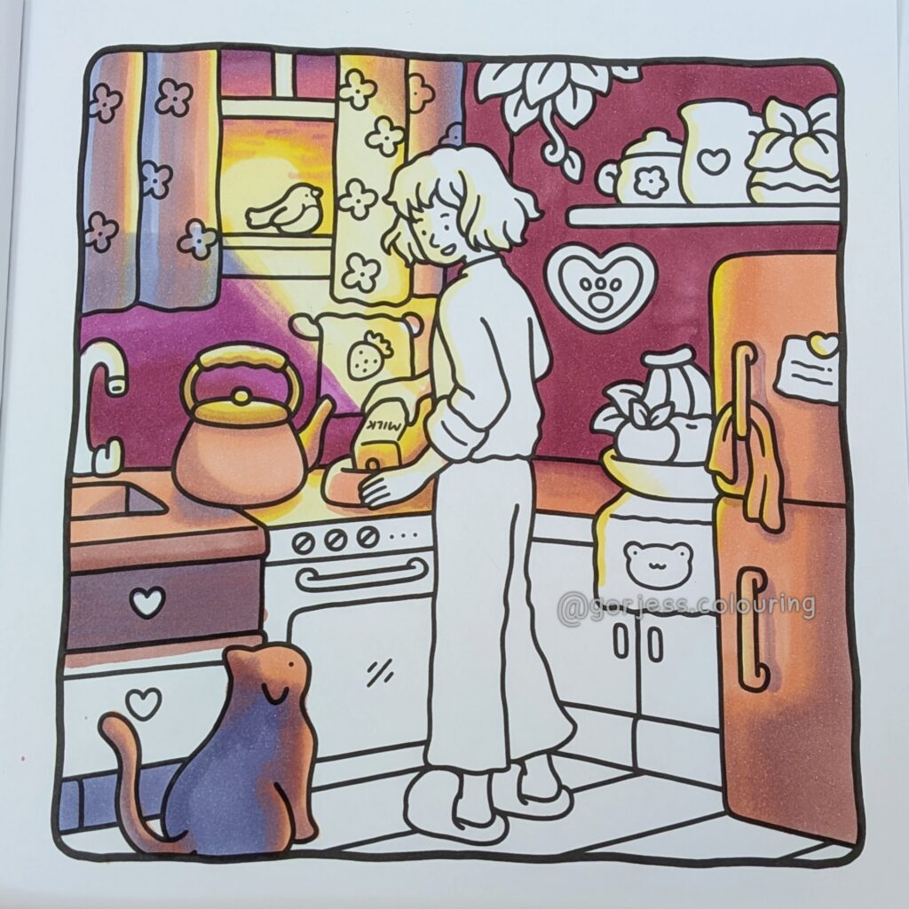
Once my base colours are completed, I like to add more depth, dimension and detail with pencils. Most often this is using darker shades to add more depth to shadows, and lighter shades to add subtle highlighting without using harsh lines of gel pens.
At this stage I like to take a few photos of my page and look back at them to see where I can improve or where the image needs more highlight/depth. I think the lighting shows up better in photo versus looking at the page directly. At this stage you can also add little details like patterns and other special effects.
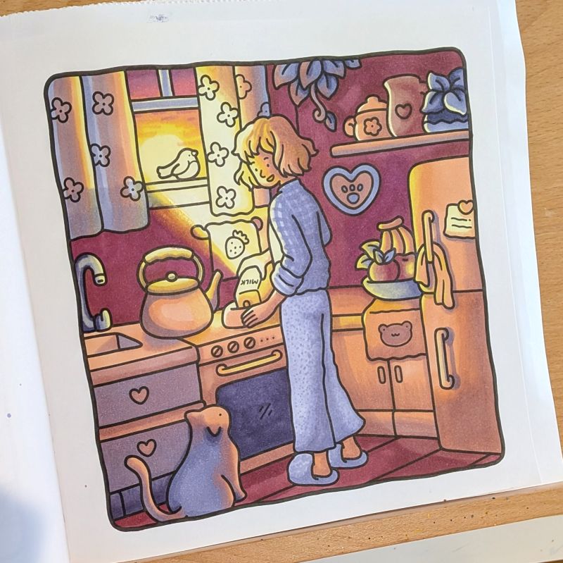
Almost there! This is when my page looks pretty much finished, but I want to ruin it, I mean, highlight it, with gel pens. Jokes aside, I find this part the most challenging and nerve wracking of the whole colouring process! One misplaced line can ruin a page for me so I’m pretty nervous doing this step! I find that placing some subtle highlights with white pencil first can help to ‘test’ a highlight before it is finalised with white gel pen. Remember, you don’t HAVE to highlight with white pen. I’ve found that my style is better with subtle highlights and I only use white pen for objects that need a bright reflection, like glass, metal etc.
This is also the time to add sparkles, dust motes and other small details that can really tie the page together.
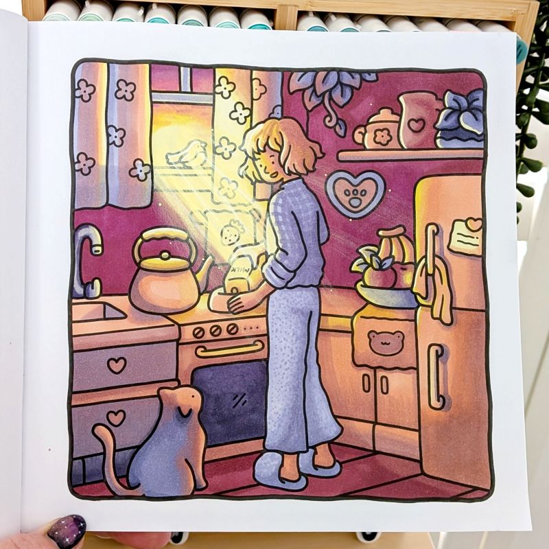
Et voilà! It’s done! Sit back and bask in the glory of your art work. Or stare with dissapointment if you don’t like it. Either way, you’ve learned something from the page right? What worked this time and potentially what didn’t. That’s what I love about colouring and art, you create no matter what, and learn something every time.
Remember, if it’s not fun, don’t do it. Make your colouring process, whatever it is, fun FOR YOU. This is how I colour, but it may be way to structured/planned for you. Or, you may want to make it more planned! Do what makes you happy, after all, that’s what making art and colouring is supposed to be about, right?
I may earn a commission from any purchases you make after you follow links in this guide. A rainbow galaxy
I may earn a commission from any purchases you make once you follow links in this guide. Sunrays can completely