My Colouring Process: From Blank Page to Finished Artwork
I may get a small commission from purchases made after clicking links in this article. Have you ever looked at

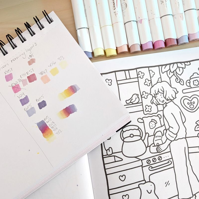
I often see colourists posting on social media about how they aren’t happy with their colour choices and they hate how their finished pages turned out. When I’m colouring the easiest thing I can do to make sure my page is cohesive, and reduce the likelihood I’ll hate myself later, is to plan out my colours with a palette and swatch. Choosing a cohesive colour palette and swatching it before you start colouring can make a big difference to your colouring. This article will go through how to choose colors for coloring books and pages using this method.
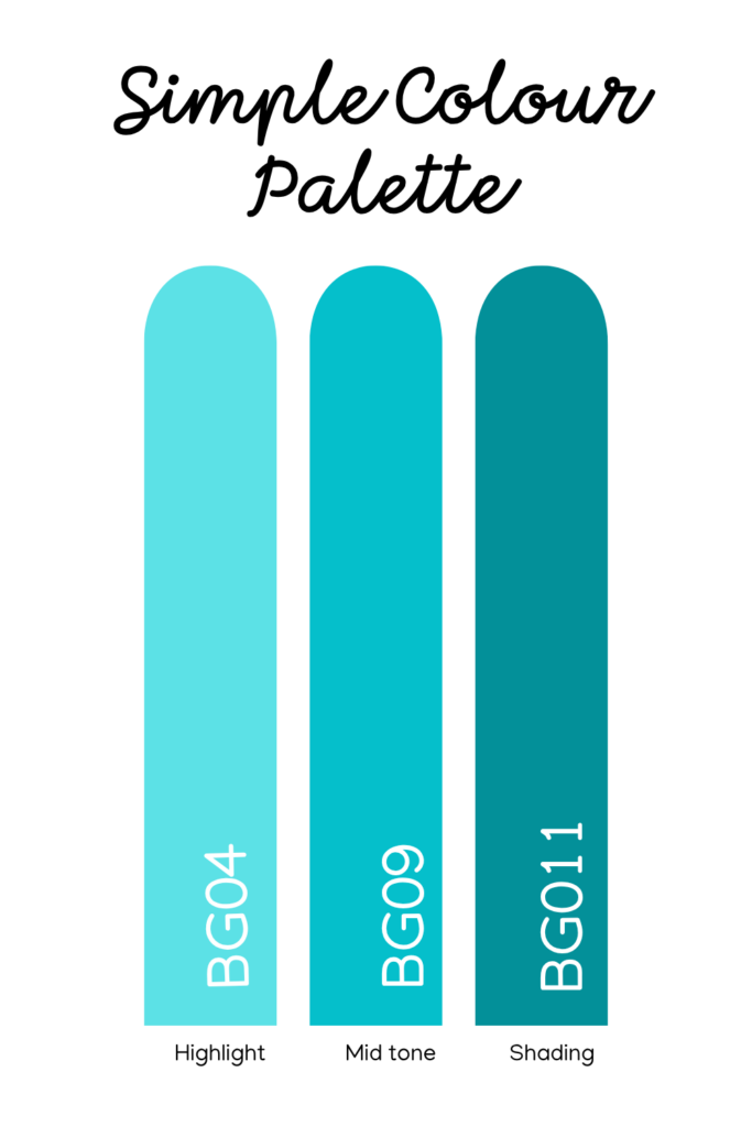
A colour palette is a group of colours that are intended to be used at one time. If you want to get fancy, you can use the colour wheel and theory to create your palettes, but you don’t have to. Colour palettes can be as little as one colour (and shades of that colour as it is layered), or as many as you like, depending on how complex the page is.
For beginners I would recommend choosing at least 4 – 6 colours for a page, and depending on what you are colouring, plus the shades lighter and darker to that for highlights and shading.
A colour swatch is a marked piece of paper with small shapes of your colours with their marker codes labelled. It’s very useful to see what the markers you are planning to use look like together before you even start colouring (and hate the choice you made). This type of swatch is separate to the swatch sheets that often come with your marker sets and can be used to help you choose the colours initially.
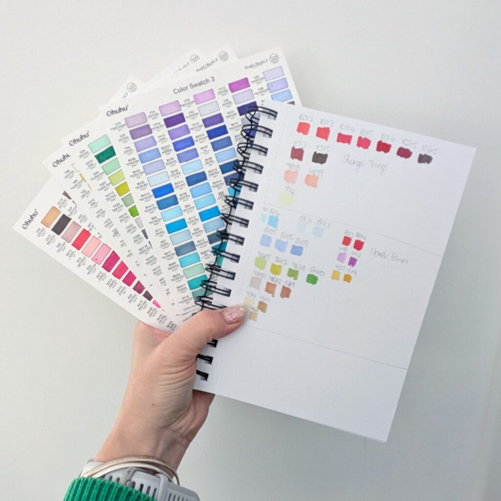
You don’t have to get fancy with your swatches for each page, a scrap piece of paper is more than adequate (and in fact, what I started out using). But, if you want to keep your swatches all together and easily be able to reference them in the future, using an alcohol marker sketch pad or bound swatch sheets is all you need.
Swatching is easy – and fun! Just start off my choosing a colour you like and then some other colours you think will go with it. Draw little squares or circles on your paper, I like to group like colours together (i.e. blues with blues) or you could group colours together based on what part of the page they are going to be used for (i.e. grass or bricks etc.). Don’t stress if you choose a colour that looks bad, just make a note or cross it off the palette and then try another. You can always make another, clean, palette with your final colour choice once you’ve finished.
Are you stuck for inspiration for a page and have no idea what colours to choose? Here’s where a little time spent on research can help alot. I like to use Pinterest to save images of awesome colour palettes and scenes similar to the one I’m colouring to see what colours I might need.
Sometimes inspiration completely leaves the building and this is where copying someone elses marker codes and technique for your page can be great. It means you can switch your brain off and just enjoy the process, rather than worrying about what the final page might look like. Alot of beginner colourists with anxiety or perfectionism preventing them from starting a page prefer this method to get themselves started. Remember to attribute the original artist you were inspired/copied though if you post online!
Swatching and choosing colours is one of my favourite parts of the colouring process, I hope you love it too! It’s such an awesome tool to make sure that your colours look great together.
I hope this helps you find how to choose colors for coloring books. Do you have other sources of inspiration for your colour palettes? Let me know in the comments!
I may get a small commission from purchases made after clicking links in this article. Have you ever looked at
I may earn a commission from any purchases you make after you follow links in this guide. A rainbow galaxy